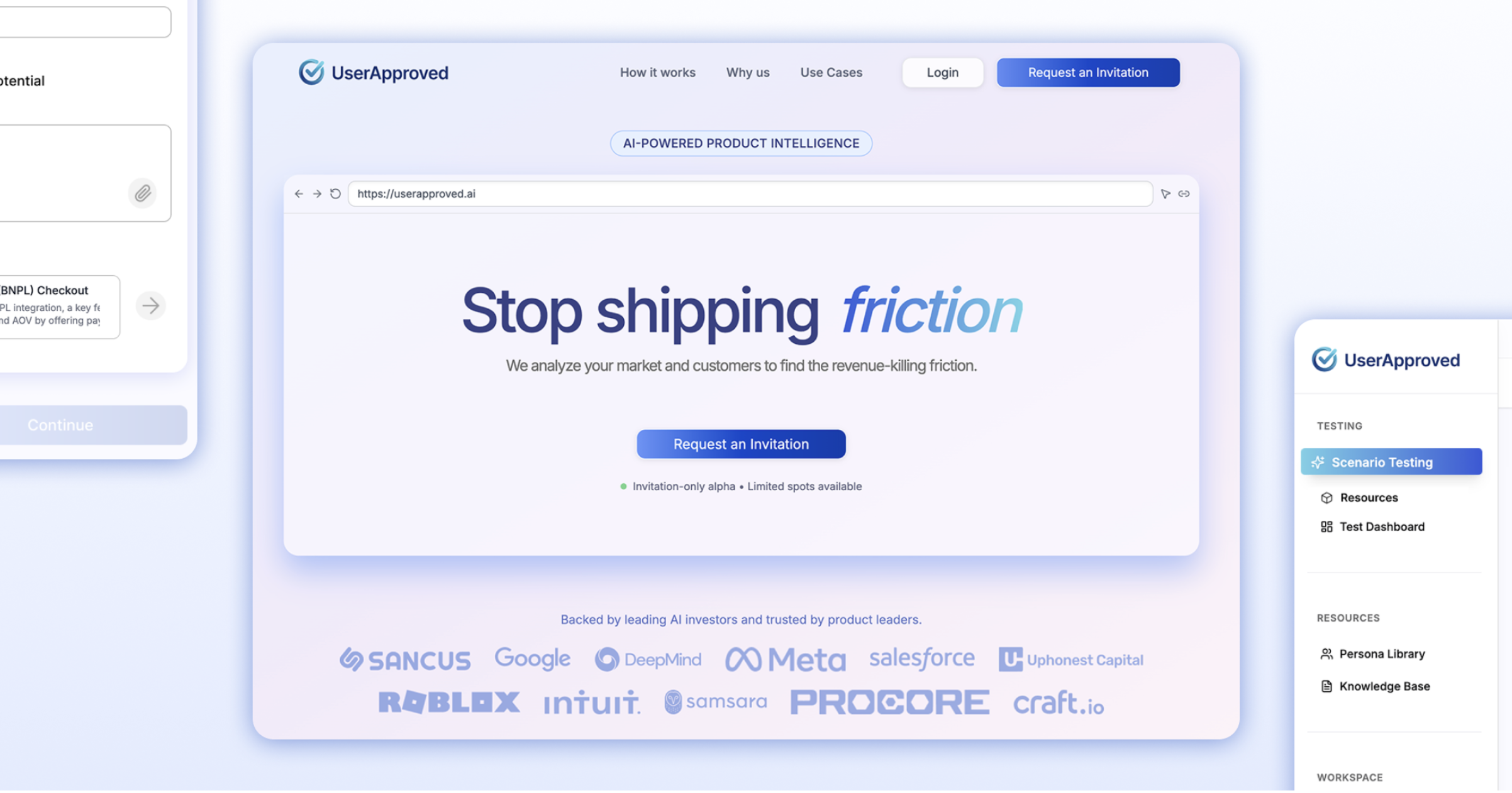
Designing an AI product to create and manage synthetic users for ecommerce companies
Impact
- Shipped over 5 core product features including redesigning onboarding and activation flows, increasing completion rates and improving first-time user activation by 40%.
- Built and scaled a design system adopted across the entire product, cutting design-to-development handoff.
- Collaborated directly with over 15 early users and senior product managers for feedback, interviews, usability tests, and UX audits that informed redesigns and simplified key workflows, implemented solutions in Figma.
- Worked with a team of 4 to accelerate changes and ship quickly, directly coding frontend changes (React, TypeScript) to accelerate release cycles and reduce QA bottlenecks.
Overview
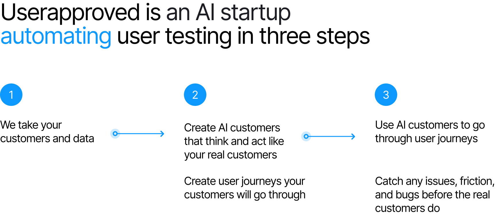
An AI tool for simulating users and testing product iterations
Over three months at a fast-moving AI startup, I wore multiple hats as a product design intern, designing, prototyping, coding, and testing across the product. I worked directly with engineers and early users to iterate quickly, shipping 5+ core features, building a design system, and leading key UX redesigns.
Userapproved is a UX research and product iteration tool simulating users to gain insights and test product iteration.
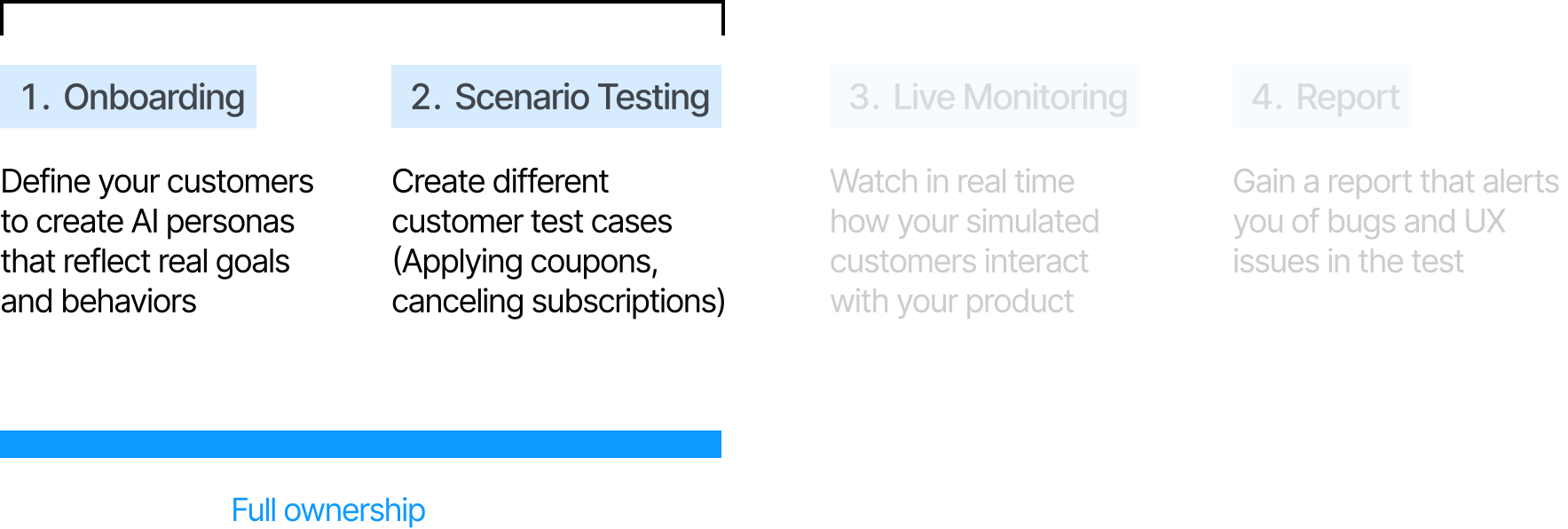
The goal was building an easy, customizable tool that teams could quickly adapt their workflows and use to improve products efficiently.
Problem
Broken onboarding and cluttered UX made it hard to see value
When I joined, three core problems were holding the product back:
- Onboarding and activation flows were fragmented and confusing, with limited activation for new users and an unclear first experience.
- The core product experience was cluttered: dashboards, reports, and navigation structures were overwhelming and workflows weren’t optimized for efficiency.
- The product had no consistent design system, which slowed collaboration between design and engineering and introduced inconsistencies into the UI.
Exploring
Mapping the product experience
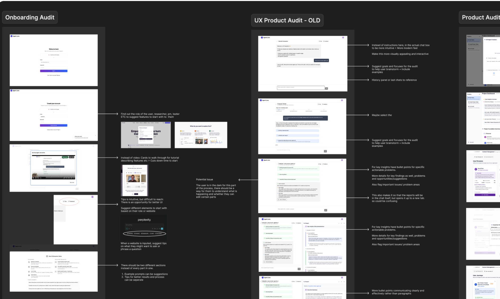
Initially, I had to create audits to analyze the existing product. Through audits I got an idea of where there might be friction points in the user experience, and what to start to build on when interviewing users. Then I conducted market research, understanding the product space and competitor products.
Defining
Understanding what users needed through interviews
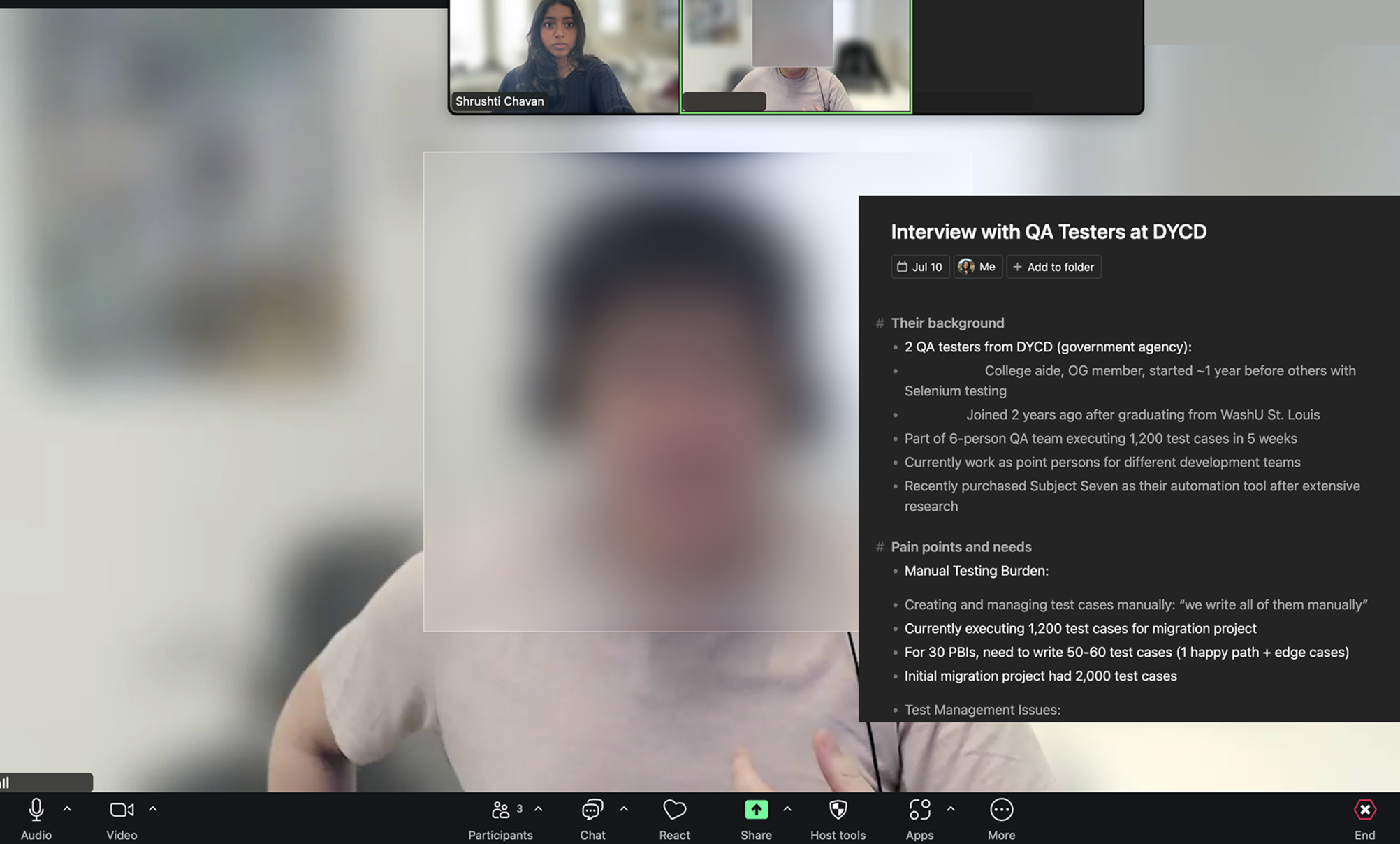
Research: Interviews
I conducted a total of 10 interviews across QA Testers, Product Managers, and Product Designers. This was the most exciting and rewarding part of conducting research because I really understood what users wanted! Especially being on such a small team, being able to hear pain points directly from experienced users and relevant customers was really helpful.
Some key insights learned were:
- Insight 1: Onboarding is confusing, users need clearer guidance and personalization
- Insight 2: The report is overwhelming, users need summaries, fast synthesis, clear communication.
- Insight 3: The interface is confusing, users need a unified design system and structure.
"I'd rather have that step by step. This is me. This is what I'm looking for, and then you give me what I want."
"If I click projects, is this the main page I see right away?"
"The first page to be, like, super complex. Like, over all the, you know, cognitive overload."
"I just want a quick snapshot of that. Of, like, percentages, maybe some graphs, make it look pretty. I don't want all the text."
"Having a good way to organize it, having a good way to maintain all of it without having to go to each and every single test case… that's also very important."
Design
Designing activation flows for new users
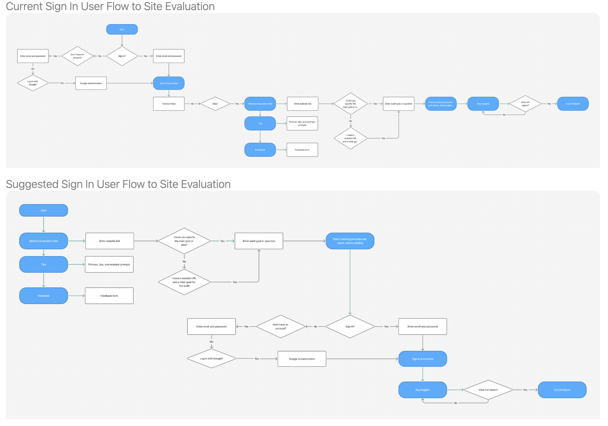
After getting the green light on the proposals, I was able to start designing! I started with creating iterations of activations for new users, first mapping it out in a user flow and then creating suggested changes to show the team.
Iterating
Prioritizing onboarding, navigation, and clearer reporting
I prioritized working on:
- Simplified onboarding and dashboard flow for clearer user value
- Better information architecture especially for navigation and project creation
- Decluttering report/Communicating impact more effectively
Solution
Foundational design structuring the product experience and design system
I learned so much and shipped over 5 core product features including redesigning onboarding and activation flows, increasing completion rates and improving first-time user activation by 40%. I worked through several ideas implementing what was important to the user especially with improving the sitemap, organizing different features, and shaping the report pages. I built and scaled a design system adopted across the entire product, cutting design-to-development handoff.
I learned how to move fast, make confident design calls, and back up my reasoning even when things were uncertain. Beyond design skills, I picked up skills that school could never teach me: shipping real features, collaborating deeply with engineers, and building systems that scale.
This work is under NDA. Contact me to dive deeper, or visit UserApproved.ai.