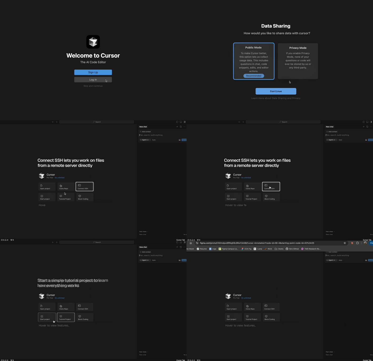
Redesigning Cursor’s onboarding for developers at every level
Impact
- Led research interviews, identifying key user pain points and improving onboarding and accessibility, resulting in a more intuitive user experience for both beginners and experienced developers.
- Led wireframing and early design iterations, addressing navigation issues and confusing terminology, resulting in a streamlined onboarding experience for users at all skill levels.
- Created and presented design decks, clearly communicating user insights and design decisions, which helped align the team and stakeholders on key product directions.
Overview
Testing whether Cursor works for novice and experienced developers
Cursor is an AI-powered code editor designed to help developers in writing, debugging, and optimizing code.
Declaring that it was made for both novice and experienced developers, we wanted to test how well it actually works for different types of users. In our analysis, we tested getting started with Cursor, how helpful AI suggestions are, and whether it is an intuitive experience.
Problem
The problem space
While using Cursor, we found that many users struggled with onboarding, understanding the interface and starting a new project.
- Onboarding is hard to understand
- Interface includes hidden features and unfamiliar terminology
- Starting a new project takes too long
Our goals
- Make it easier for new users to understand the onboarding
- Fewer usability errors and hesitations
- Make it faster and much simpler to create a new project
Evaluative research
Competitive audit and early design exploration
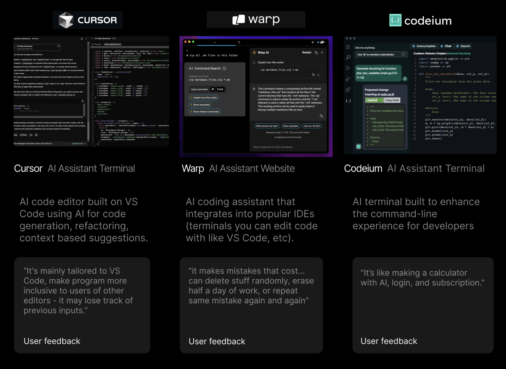
Competitive audit
We began with a competitive audit to understand how other AI-powered editors and developer tools approach onboarding, first-run experiences, and surfacing AI features.
How might we
How might we streamline Cursor’s onboarding and redesign the first-time experience to feel intuitive and efficient for developers?
Design version 1
Based on our audit and early synthesis, we explored a first design direction focused on clearer entry points, simplified navigation, and a more guided first-run experience.
Unmoderated testing
Testing download, setup, and first use
Using usertesting.com and Dovetail
We conducted 3 unmoderated interviews. Using usertesting.com, we screened and recruited experienced developers to conduct a task flow downloading and using Cursor, then using our prototype.
Our tasks for unmoderated testers
- Download Cursor
- Start a new project
- Use our prototype and compare
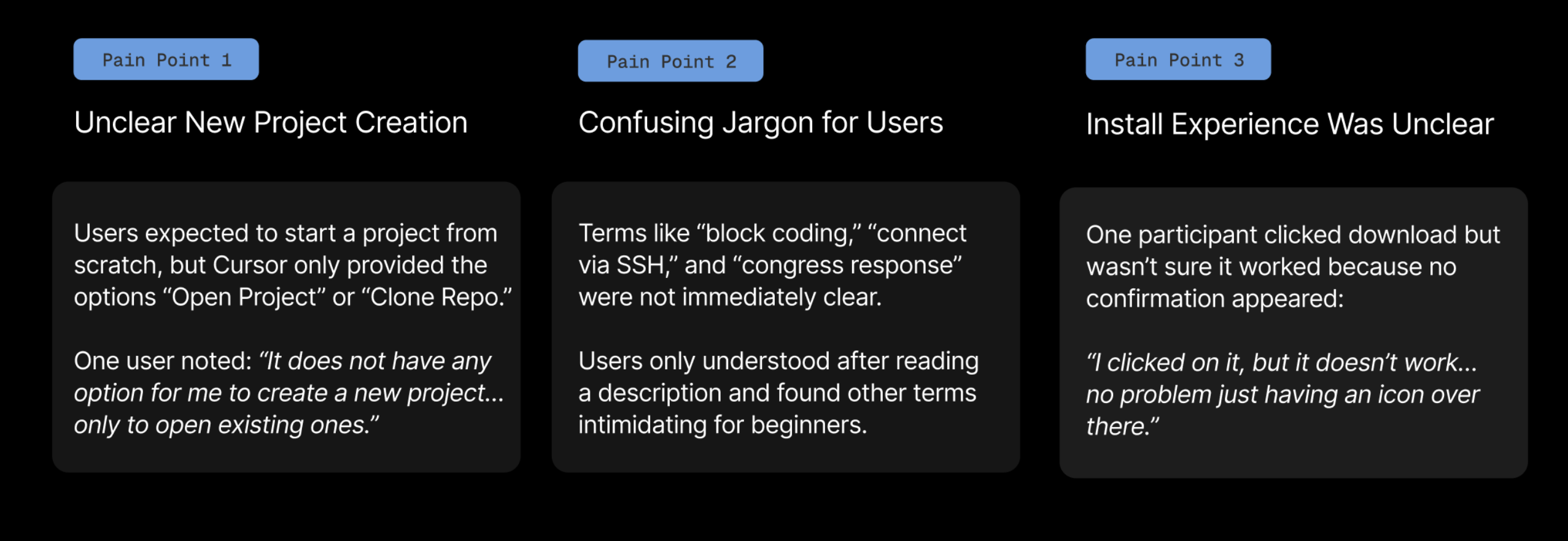
Pain points
Insights
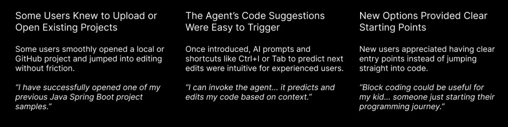
Based on the interviews, we identified what worked well across onboarding, AI interaction, and the beginner experience:
Moderated testing
Prototype walkthroughs and live feedback
Using Figma and Dovetail
Similarly, recruiting participants, we conducted 3 moderated interviews on Zoom.
Our participants were experienced developers, two familiar with Cursor, and one new to Cursor.
Our tasks for moderated testers
- Navigate our prototype
- Engage with feedback
Quotes
“It’s hard to read. But you know what will help? Let’s say I click on it and then this search window. If it pops right on top of this one. Then I know like you click on it and there’s another screen opens where you search.”
“I would have liked if before I signed up, if there was just something telling me what Cursor was a little bit more.”
“Yeah, I definitely think adding these three buttons will benefit like beginners or people who are not very familiar with VS code who just want to start live coding.”
Insights
Based on the interviews, our identified user pain points:
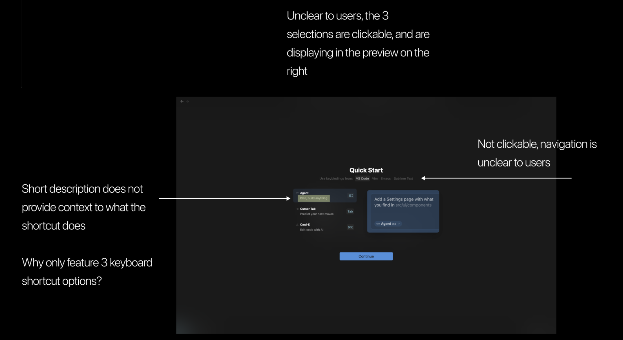
- Search and discovery patterns are unclear: users need stronger visual affordances when one action opens another layer of the interface.
- Pre-signup education is too thin: new users want a clearer explanation of what Cursor is before committing to download or create an account.
- Beginners need explicit starting paths: guided entry points help users who are less familiar with VS Code get into live coding faster.
Solution
A more guided first-run experience for every skill level
Our proposed redesign focused on making Cursor’s value clearer before signup, simplifying how users start a new project, and giving beginners obvious entry points without hiding power-user workflows.
Design version 1 introduced clearer onboarding language, more visible navigation for core actions, and beginner-friendly starting options informed by both unmoderated and moderated testing.
Outcomes and reflections
What we learned and where we’d go next
We learned how important it is to design onboarding especially more intuitively, with clarity, and with different experience levels and accessibility in mind.
We realized that even small changes like instruction or clearer buttons can ease hesitation for users.
If we had more time, we would’ve tested with an even wider range of users, including complete beginners, and incorporated accessibility needs earlier in the design. Moving forward, we plan to explore more personalized onboarding options, stronger support features like FAQs, and long-term testing to see how the experience holds up over time.